


Accessibility in internal tools is often addressed late, as a visual check before release. However, an operations dashboard, a CRM, or a support application can fulfill its technical purpose while preventing some team members from searching for a record, correcting data, approving a request, or closing an issue.
The impact is not limited to people with permanent disabilities. It also affects people who use only a keyboard, work with a screen reader, have a temporary injury, use a small screen, operate in low light, or need to understand an interface under pressure. In an operational environment, every barrier translates into delays, errors, dependence on another person, and reduced traceability.
The goal is not to artificially simplify complex processes. It is to ensure that the required tasks are perceivable, understandable, operable, and verifiable by the people who need to perform them.
Start with operational risk, not a checklist of controls

Before reviewing isolated components, identify which workflows support daily work. An interface may have minor defects in secondary areas and still allow people to work. In contrast, a single barrier in an approval or data update can stop an entire process.
Build a brief map of roles, tasks, frequency, consequences, and real alternatives. For example:
- Support agent: searches for a case, reviews its history, updates its status, and responds. If they cannot filter or save, resolution time increases.
- Operations manager: reviews exceptions and approves changes. If focus does not reach the confirmation, they may approve incomplete information or fail to complete the task.
- Administration: creates users and assigns permissions. If form errors are not announced, they may create accounts with invalid data or abandon the process.
Prioritize workflows that combine high frequency, high impact, irreversibility, or no alternative. Priority should not depend only on how easy it is to fix a defect technically. Ask: what happens if a person cannot complete this step without help?
Design navigation that enables people to understand and complete the workflow
Semantic structure provides a consistent model for assistive technologies and improves interface maintenance. Interactive controls must use the appropriate element for their purpose: a button to perform an action, a link to navigate, and a form field to enter or select information. Replacing them with generic containers with click events requires recreating keyboard, focus, and state behavior that the browser already provides.
A person navigating with a keyboard must be able to reach every operable control, move through them in an order that is consistent with the task, and clearly identify where focus is. Avoid removing the focus indicator without providing another visible equivalent. It is also advisable to avoid manual tab orders unless there is a strong reason to use them: they often disrupt navigation when the screen changes or a component is reused.
Context changes require particular care. Opening a dialog, expanding filters, or updating a section after saving should not be disorienting. If a dialog appears, focus must move into it, remain within its context while it is open, and return to a logical point when it closes. If a search updates results without reloading the page, communicate what changed and keep focus where it helps the person continue the task.
Forms, filters, and tables: making complexity manageable
Internal tools concentrate business rules in extensive forms, combinable filters, and dense tables. Accessibility does not require removing that complexity, but rather expressing it through labels, instructions, and states that can be interpreted without implicit visual cues.
Creation and editing forms
- Associate each field with a visible, specific label; example text inside the field does not replace it.
- Indicate format, required status, and dependencies before the person makes an error, especially for dates, amounts, and identifiers.
- After validation, describe the error next to the field and provide an accessible summary when there are multiple errors. Move focus to the summary or the first error depending on the context, and maintain a clear way to review them.
- Do not use color, icons, or position alone to distinguish invalid fields, pending changes, or required values.
Search and filters
A filter must indicate which criterion is applied, how to remove it, and how many results remain if that information is relevant to making a decision. Active filters should not rely solely on color-coded labels. If they are applied automatically when a selection changes, announce the update; if there is an Apply button, make clear which values will be submitted when it is activated.
Operational tables
Use headers that explain each column and provide understandable relationships between headers and cells. When a table is too wide, do not assume horizontal scrolling will be obvious or convenient: consider a detail view, configurable columns, or an alternative presentation on narrow screens. Row actions must identify the affected record; a sequence of buttons labeled only “Edit” requires people to infer context that may not be available.
States, blocked actions, and irreversible decisions
Success, error, loading, or update messages must remain visible long enough to be read and be communicated programmatically when the change does not receive focus. A transient message placed in a corner may go unnoticed by someone typing in another field or using a screen reader.
Irreversible actions, such as deleting a record or approving an exception, require a confirmation that names the consequence, the affected object, and, where appropriate, a cancellation option. It is not necessary to confirm every action: doing so indiscriminately creates fatigue and mechanical confirmations. Reserve this pattern for operations that are difficult to undo or have a high impact.
An HTML control with the disabled attribute does not normally receive focus, so a visual explanation next to it may be inaccessible during keyboard navigation. Use a disabled control only when it is appropriate to indicate that the action is unavailable at that moment, and ensure that the reason and the next step are exposed programmatically and available in the workflow before reaching the control.
In other cases, it is preferable to keep an action operable: when activated, it can explain outstanding requirements, move to the field that must be completed, or direct the person to the valid path for requesting permission. For example, if an owner has not been selected, the button can explain the requirement and move focus to the selector. The choice must avoid both a misleading action and a silent block.
Permissions without losing context
Adapting actions to a role is necessary, but completely hiding relevant information can create confusion. Distinguish between data that must not be disclosed and actions that are simply not authorized. If a person can view a request but cannot approve it, they may need to know its status, who can take action, and what the next step is. That context reduces unnecessary retries and escalations.
Document permission rules as part of the workflow: what each role can view, what it can modify, what happens when permissions are lost during a session, and how a denial is communicated. Authorization errors must describe the action that is not allowed without revealing sensitive data.
Test real tasks, not only isolated screens
Automated reviews detect valuable issues, such as missing labels or insufficient contrast, but they do not by themselves validate that a complete task works. Combine automated checks, code review, and manual testing with a keyboard and assistive technologies available in the environment.
- Creation: create a record with invalid data, identify the error, correct it, and confirm the saved result.
- Search: apply two filters, interpret the results, remove one criterion, and open the correct detail view.
- Update: edit a conditional field, receive validation, and save without losing the working context.
- Approval: review information, identify outstanding requirements, confirm the decision, and check the new status.
- Issue: locate a case, add a note, change its priority, and attempt to leave with unsaved changes.
For each case, define an observable outcome: the task is completed without a mouse, focus never disappears, errors are understandable, changes are announced, and the person can recover the previous state when appropriate.
Integrate accessibility into the product lifecycle
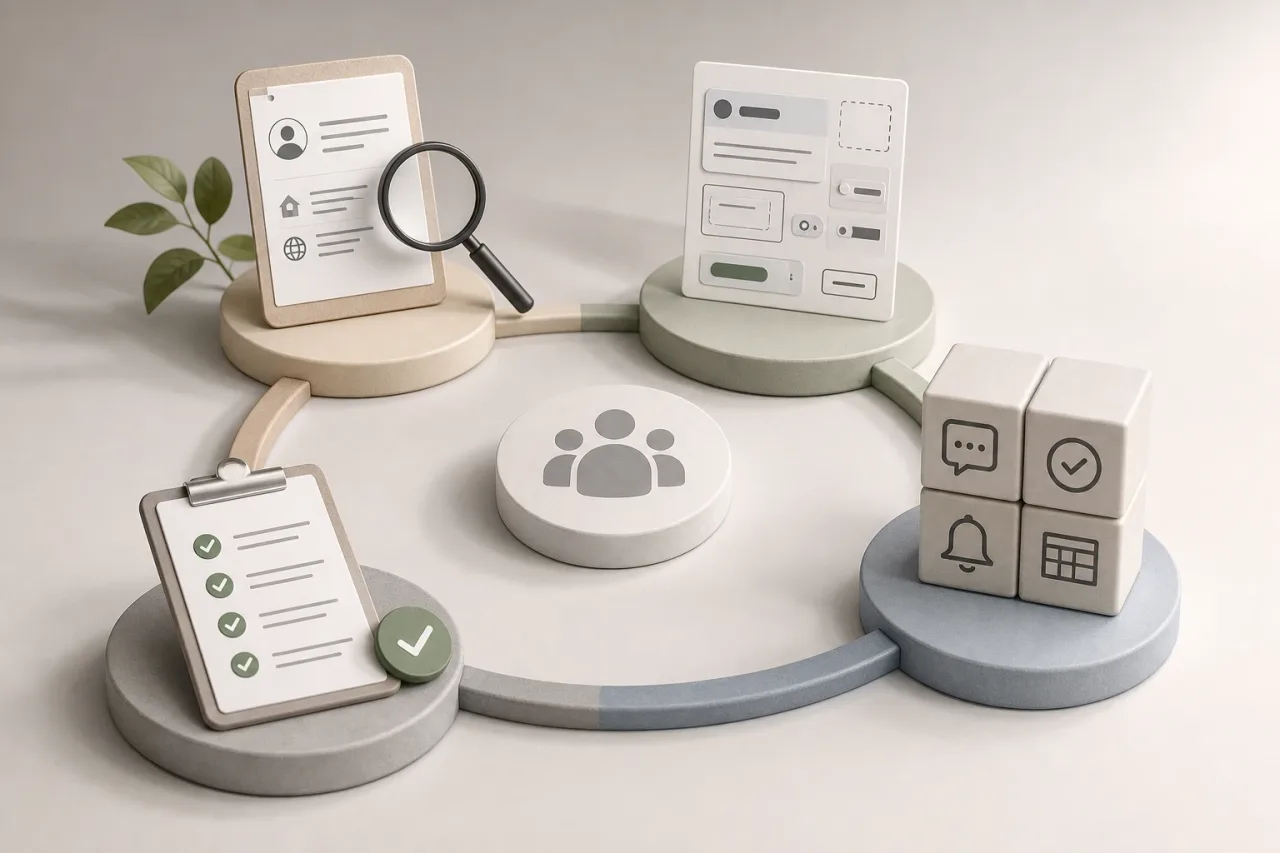
Turning findings into sustainable improvements requires incorporating them into routine decisions. In discovery, describe users, context, and constraints. In design, review focus order, states, messages, and screen variants for error states or insufficient-permission states. In development, agree on reusable patterns for dialogs, validation, notices, and tables. In quality assurance, run critical cases before releasing changes.
Acceptance criteria must be verifiable. Instead of “the form is accessible,” define conditions such as: “all fields have an associated label,” “errors are announced and linked to the affected field,” or “approval can be completed using a keyboard.”
Finally, measure the effect by workflow: percentage of completed tasks, avoidable errors, recurring issues, abandonment, and resolution time. Segment information carefully and without turning it into an individual monitoring mechanism. If a change worsens these indicators or introduces a barrier in a critical task, treat it as a product defect with priority appropriate to its operational impact.